Labels

Friday 17 December 2010

Band Name Fonts

Quilted Butterfly

We like this font as it has connotations of Alice in Wonderland – it’s feminine, yet appears slightly scratchy and implies a certain edginess. It’s whimsical, and yet the splattered ink effect makes it seem passionate.

Jellyka Castle's Queen

The second font is quite feminine but has a 'halloween' edginess to the font which will show the personality of the artist of being feminine, but also quite mysteriously edgy.

Jellyka Western Princess

This font was chosen because it uses the feminine look with the flick on the font shows the edginess of the artist, however the italic font conveys the feminine personality.

Discipuli Britannica

This font isn't as good as it is quite small and doesn't show the representation of our artist as much because it is a bit to feminine rather then being edgy and mysterious.


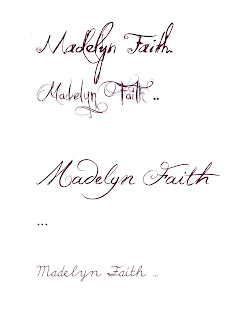
We have chosen the name of the artist to be Madelyn Faith, this is because the artist influence that we have looked at such as Tori Amos, Kate Bush and Florence and the machine all use their own name as the artist rather then a band name made up. Madelyn is also an old fashioned name and goes together with the Faith surname.


Tuesday 14 December 2010

Influence Album covers


After looking at all these album covers of artist influences, Siani and I have noticed many different similarities to each other that would be good to use in our own Digi-Pak such as flow dresses, dark and earthy colours; for example in Tori Amos album 'Scarlets Walk' where she is standing at the end of an open road which looks dusty and deserted . Also there are many that has the artist but the artist is never centered, they are on their side, facing away and on her side.
All these album covers have a key theme of looking quite old and vintage ; the artists also look quite distraught and destressed both the audience have actually heard the artist songs. There is also a contrast with nature which is seen as 'beautiful' and 'peaceful'; for example in Kate Bush album 'The sensual World' includes her holding a rose, in contrast with the dark colours and disturbing images; for example the Kate Bush album 'Never For Ever' which includes pictures of ducks and bats.

Digi-Pak draft


After discussing both me and Siani's designs we decided on the different parts of each design that we have wanted to use and thought would look good together.
- Pale colours and patterns throughout
-'Vintage' look on the cover
-Polaroid photo look of two pictures of the artist.
-Hand written lyrics on a pale background and bright writing.
-A mid shot/ close up of the artist wearing a mask.

Tuesday 7 December 2010

Digi-pack Cd covers


What is a digi-pack?
A digi-pack is a CD package which represents/ promotes the CD and the artist. It's a fold out booklet made of cardboard, with the CD generally placed in the middle of the digi-pack.

What makes an effective digi-pack?
- The same design/ colour scheme throughout.
- Folds out into a picture.
- Strong and contrasting colours to catch the attention of the audience
- Images that represent the artist (such as graffiti or cartoon)
- Pictures of the band/artist.
- The use of cover art.


Cd cover influences


By looking at different cd covers and ideas that Siani and I have looked at similar artists and have decided to use some of the ideas from similar cd covers which has influenced and helped us gain new ideas to create our own cd covers. Alot of these album covers are seen as simple but with the random one bright colour of the picture it looks good and attracts the audience attention. Siani liked the look of the Lady Hawk album which involved the sketch look for an album cover, as well as the new Ellie Goulding album 'Lights' because she found the lights from the album made the album look interesting.
My favourite album within this collage is the Mika album cover; this is becuase it is bright and colourful, however it looks like a 'dream' or collage of different random animated images